
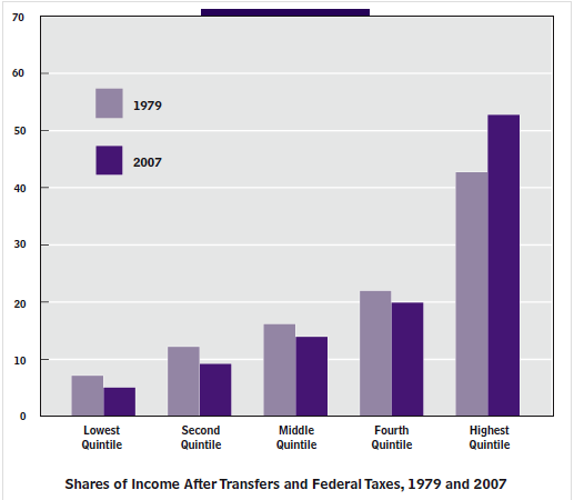
Income inequality is a hot political issue today and I have frequently discussed it on this blog. In particular, the chart just below shows that income inequality is only slightly worse since 1979, after government transfers and federal taxes are taken into account.
The AEI scholar, Mark Perry, has analyzed the 2016 annual report from the Census Bureau on “Income and Poverty in the United States” and points out the very strong correlation between income inequality and household demographics.

For example:
- The mean number of earners per household increases steadily from a low of .43 in the lowest income households to 2.04 in the top income households.
- The marital status of householders. The share of married-couple households is only 17.3% in the bottom income quintile and then increases steadily to 76.5% for the top income quintile.
- The age of householders. In the lowest income quintile only 42.4% of households included individuals in the prime earning years of ages 35-64, while 69.9% of households in the top quintile include individuals in this group.
- The work status of householders. Only 18% of the lowest earning quintile households included an adult who was working full time, as compared to 77.7% of top earning households.
- The education of householders. Only 14.6% of lowest earning households had a family member with a college degree and this percentage rose steadily to 64% for top earning households.
Conclusion. Household demographics are very highly correlated with household income. Specifically, high-income households have a greater average number of income-earners than households in the lower-income quintiles. Individuals in high-income quintiles are far more likely to be well-educated, married, working full-time and in their prime working years. It is also true that individuals and households can and do move up and down the income quintiles as these key demographic variables change.
